1964
Harvey Hoshour
Case study by:
Lindsey Trout,Fri Oct 09 2015
First Unitarian Church

The 1960s were a busy decade. A man walked on the moon for the first time, North Vietnam and the United States were at war, and the civil rights movement was in full swing. In Albuquerque, the Winrock Center shopping mall opened and construction began on a new airport.1 However, within the city’s First Unitarian Church there were also major changes underway. In 1961, the Unitarian and Universalist church merged to create the Unitarian Universalist Association and, in 1964, the First Unitarian Church in Albuquerque started a new sanctuary addition to their building.2
Founded by Louise Pembroke in 1949 as a Unitarian Fellowship, the Albuquerque First Unitarian Church quickly grew as a liberal church. Meeting in different locations for the first six years of assembly, the church eventually settled at its current location at Carlisle Boulevard and Comanche Road. There, the congregation built what was previously used as the “social hall” as their first permanent sanctuary. As the congregation continued to grow, it soon became apparent that a larger gathering space was needed. In 1964, only ten years after officially gaining church status marked by the calling of their first minister, the congregation contracted architect Harvey Hoshour to design the new addition to their campus, a new sanctuary along with administrative offices and other spaces.3
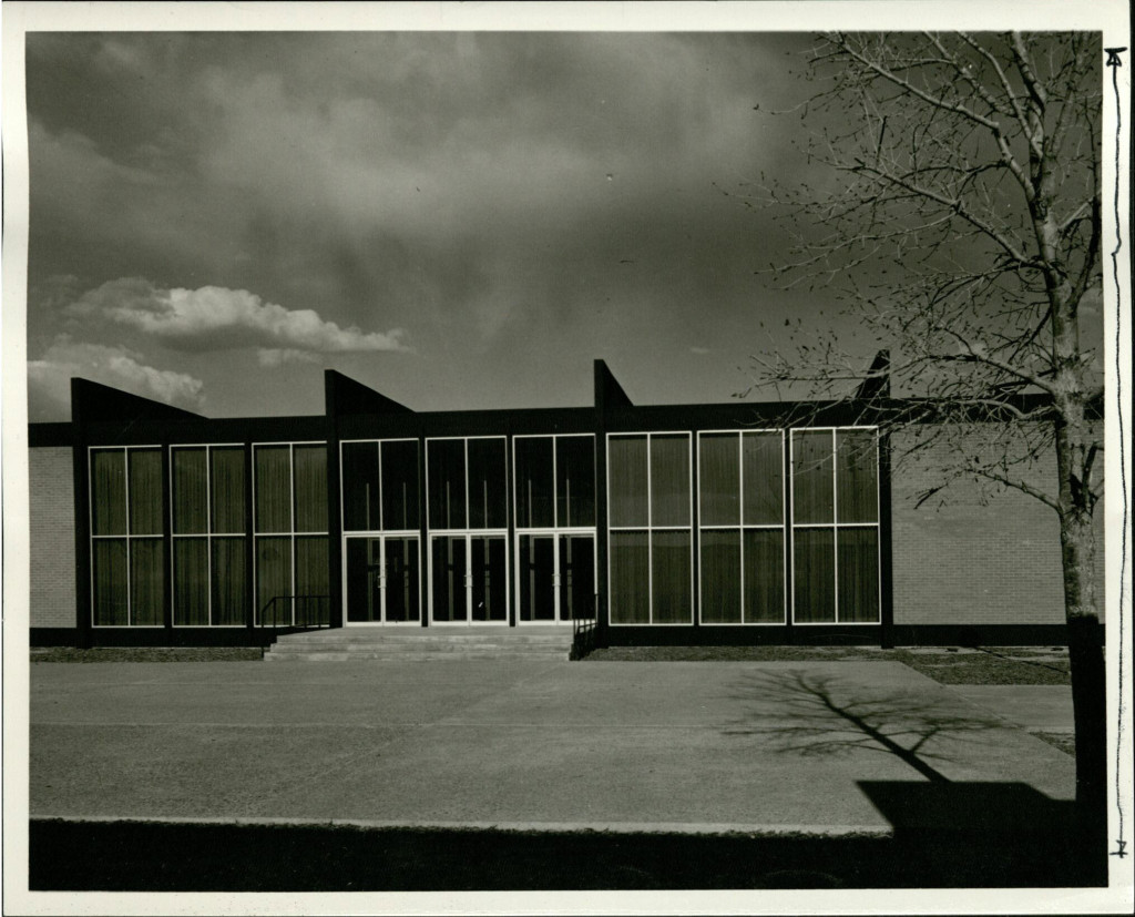
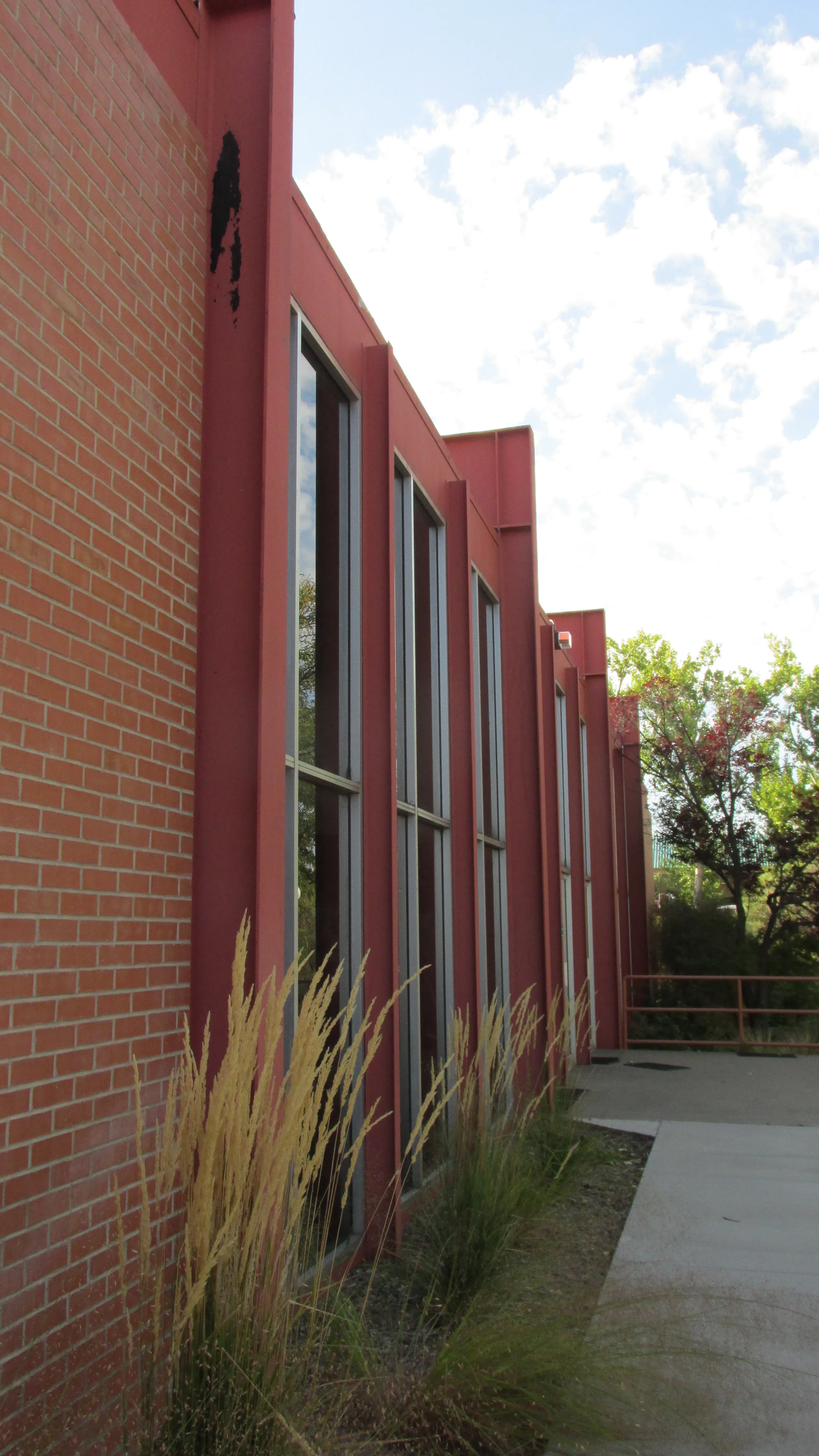
Before opening his own firm, Hoshour had worked for the modernist giant Ludwig Mies van der Rohe, beginning in 1957. Influences of Mies can be seen in many of Hoshour’s buildings, including his design for the sanctuary at First Unitarian Church. Its similarly modernist idiom is apparent even after subsequent renovations, not only in the form of the building but also in materials. The steel and glass structure is offset by masonry, recalling the work of his mentor. Likewise, Hoshour’s design celebrates its exposed steel. For instance, exposed wide-flanged beams on the glazed portion of the exterior are reminiscent of Mies’s famed design for S.R. Crown Hall at the Illinois Institute of Technology.
The Hoshour Addition
The Hoshour addition sought to tie in to the scheme set forth by the existing building. That building’s design was modern yet inspired by the vernacular, featuring much smaller windows than the addition, but with brick masonry instead of the typical stucco. Hoshour closely matched the bricks in color, making a nearly seamless transition from old to new. After the transition, however, the Hoshour addition started to take its own form, presenting a much more boldly modernist structure. One-third of his addition was made of heat absorbing glass, itself a marvel of the modern age.4 Before this technology, such expanses of glazing would have never been used in such a warm climate, but advances in glass made possible an open floor plan flooded with natural light.
The largely glass shell housed not only a new 400-seat sanctuary, but also spaces for offices, a commercial kitchen, a library, and storage. The addition added an extra 6,615 square feet to the church’s campus for its 420 members. It cost $130,000 to build, paid for by pledges from members.5 James P. Wilkes, who had come to pastor the church only a year earlier, oversaw the design, construction, and financing of the addition.6
In overall form, Hoshour’s addition comprises five structural bays. The southernmost bay, which originally held the church’s offices, connects to the original structure only through materiality. A sidewalk spans the gap between the buildings where people are free to bike, walk, or otherwise commute into the church’s campus. The next three bays contain the sanctuary portion of the building. The space is entirely open, save for the altar and the arched wall that previously held a mural by the mid-twentieth-century artist and designer, Alexander Girard. The final bay holds the kitchen and the library.
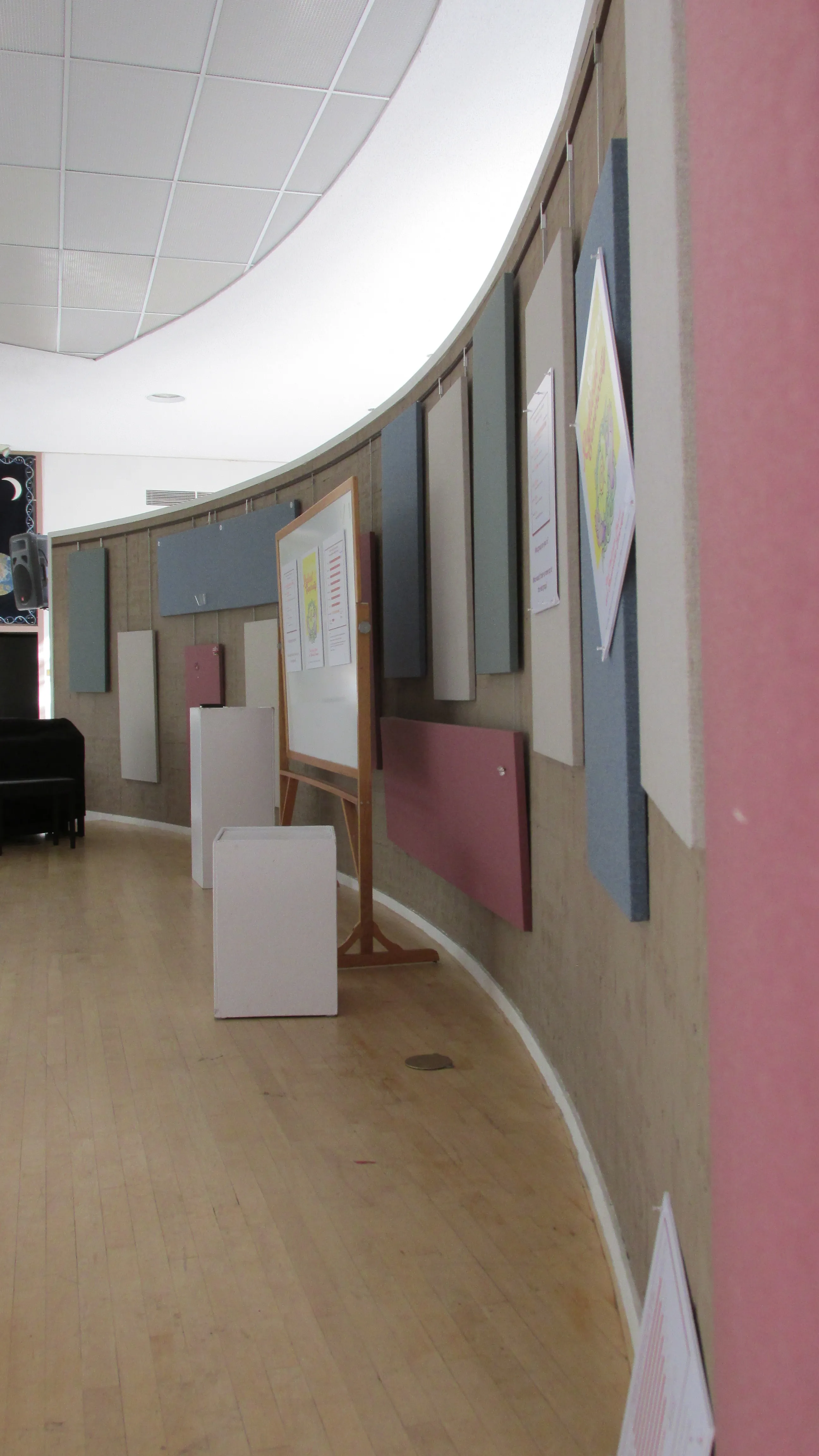
The church’s steel structure, its most defining exterior element, not only adds detail to the building, but also spans its entire seventy-foot depth. To allow for maximum open space, Hoshour attached the superstructure to the outside of the building shell, creating a suspended ceiling.7 This incredibly open, reconfigurable space has enabled use for many different purposes. Originally, it formed the main worship space for the church, but now it serves as an art gallery and the social hall for many church functions. This art gallery is used as a source of income for the church, which receives a percentage of the purchase price of each piece sold.
The effect of Hoshour’s modern language and form making was to create a spatially inventive interior, one that remains so today, even after subsequent renovations. Upon entering the structure through the main doors, the visitor is met with a double height space filled with light from the east-west facing windows. Directly to the east is what remains of the altar area. Beyond that is a wildlife habitat just outside the windows. To the north and south of the main sanctuary are the original offices and what had been a classroom. The classroom has since been turned into a hall leading to the new sanctuary. On both sides, regardless of previous or current use, the visitor is greeted with a more human-scaled ceiling height. The artful manipulation of scale forces the guest to notice the space as well as the procession through it.
The Sanctuary
While Hoshour skillfully manipulated broad spatial gestures, he and his team also controlled the finer details of the building, including its altar and pulpit, many of which remain in place today. In the former sanctuary, one reaches the top of the platform after a small step of approximately 12 inches. The rear of the stage follows the curvilinear shape of the CMU mural wall, while the front eschews the curvilinear form for a more linear face that is bull-nosed at the corners. Following the same shape as the platform, a luminous ceiling hovers directly above. Softening the look of the front area is the lectern. Located at the center of the stage, the pulpit draws from the circular form of the wall behind it, but instead of exposed lumber or block, it is adorned with fabric covered plywood.8
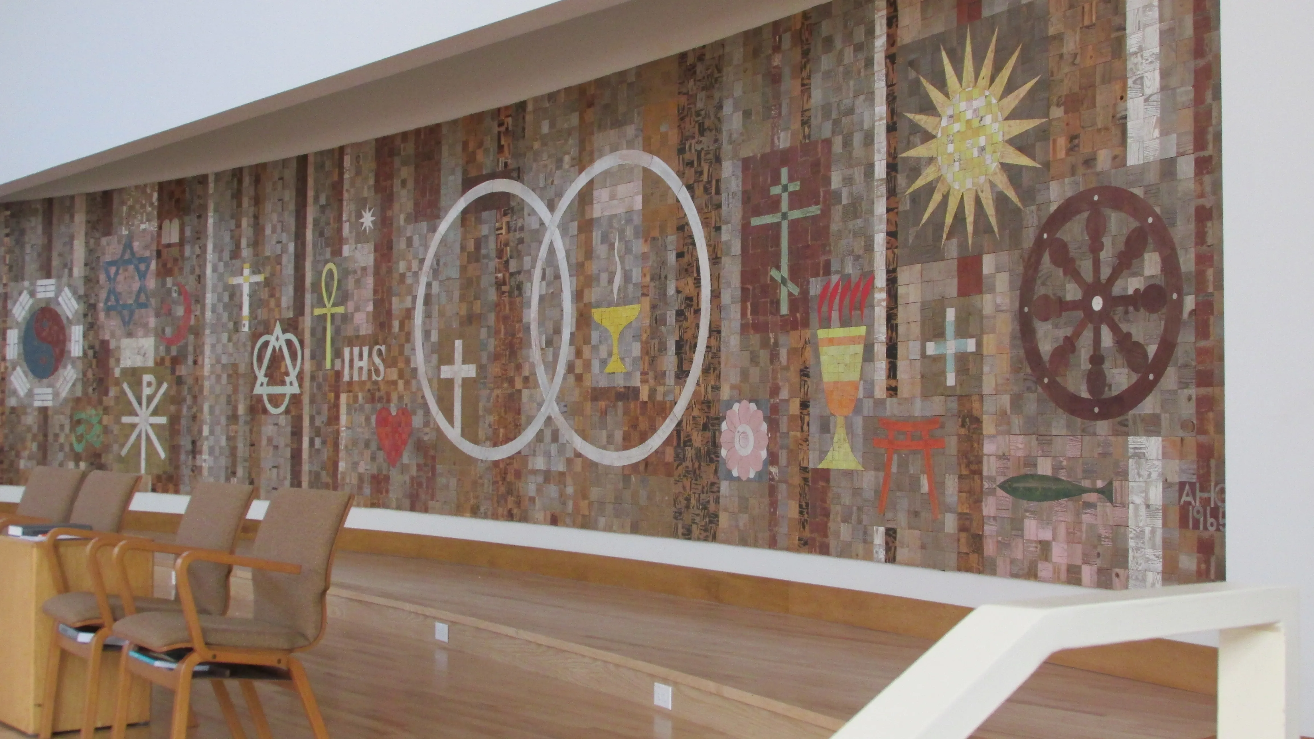
While the stage was the center of attention, perhaps the most recognizable part of the church was the mural in the sanctuary. Designed by Girard, the sanctuary mural incorporated the different beliefs of and influences on the Unitarian faith. Girard composed the mural entirely of reclaimed lumber, mainly from the Jemez area in New Mexico. Pieces included parts of fence posts, doors, and other so-called scraps. He left the lumber in its found condition, repainting none of the components to add to the rustication of the mural.9
The mural points to the many beliefs of the Unitarian Universalist faith by using twenty-two symbols to represent the many different places that their religion draws from. Included in the symbols are the star and crescent from Islam, a torii from Shintoism, the eight-spoke wheel from Buddhism, and the fish from early Christianity, among others. Girard placed these symbols around the interlocking rings of Universalism and Unitarianism to represent the diverse sources of the church’s beliefs. In the process, he created a warm and inviting modernist landmark for the church.
Recent Modifications
As in all functional buildings, the congregation has altered the church over the years to meet the needs of its occupants. As the congregation continued to grow, Hoshour’s sanctuary proved insufficient for the church’s needs. In 2012, the congregation built a new sanctuary to seat more people, and converted the Hoshour addition into the social hall. While the CMU wall that previously held the mural remains intact, as does the altar, the church moved the mural piece by piece into the new sanctuary.
They have made other changes as well, though most are not as visible as the newest addition. The church is largely concerned with sustainability; the most recent sanctuary addition even meets the LEED Platinum standard.10 In the same spirit, the church has added numerous photovoltaic panels to the 1964 addition as well as the aforementioned wildlife habitat, which not only provides refuge for the nonhuman inhabitants of the area, but also helps to shade the structure and thereby reduce cooling loads.
Even through all of these changes, the structure has always done exactly what Hoshour intended – meet the needs of the congregation. The building, like the congregation, has changed through time, and will continue to change. While the Hoshour addition is not fulfilling its original purpose, the structure is still achieving its overall goal, to facilitate the actions of the First Unitarian congregation in Albuquerque.
Footnotes
-
“City History,” Albuquerque Historical Society, accessed September 29, 2015, http://www.albuqhistsoc.org/SecondSite/pkfiles/pk47cityhistory.htm. ↩
-
“Unitarian Universalist Origins: Our Historic Faith,” UUA.org, accessed September 29, 2015, http://www.uua.org/beliefs/history/our-historic-faith. ↩
-
“UUABQ,” First Unitarian Church of Albuquerque, accessed September 29, 2015, http://www.uuabq.org/history.html. ↩
-
“$130,000 Auditorium Is Planned,” Albuquerque Journal, October 31, 1963. ↩
-
Ibid. ↩
-
Ibid. ↩
-
Ibid. ↩
-
Harvey Hoshour, “Platform & Screen Details,” First Unitarian Church of Albuquerque, September 9, 1966, Stack 4, Drawer 02, Harvey S. Hoshour Architectural Drawings and Plans (SWA Hoshour Drawings), Center for Southwest Research and Special Collections, University of New Mexico, Albuquerque, NM. ↩
-
“The Sanctuary Mural,” First Unitarian Church of Albuquerque, accessed September 29, 2015, http://www.uuabq.org/sanctuarymural.html. ↩
-
“First Unitarian Church of ABQ Addition,” U.S. Green Building Council Directory, accessed October 5, 2015, http://www.usgbc.org/projects/first-unitarian-church-abq-addition. ↩


