1975
Stevens, Mallory, Pearl and Campbell (SMPC)
Case study by:
Ronald Rozelle,Fri Oct 09 2015
Albuquerque Public Library
Introduction
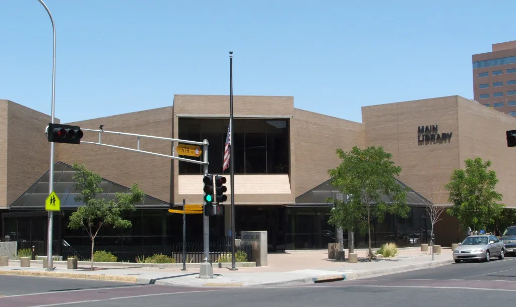
Opened in 1975, the Albuquerque Public Library’s downtown location is the main branch for the Albuquerque-Bernalillo County library system. The structure contains 104,577 square feet of floor space divided over three stories, designed in the Brutalist style by George Clayton Pearl and his firm, Stevens, Mallory, Pearl and Campbell (SMPC). It stands in the core of downtown Albuquerque between 5th and 6th Streets on Copper Avenue NW. The main entrance is set back on the south side of the three-story structure, which features a lower level, street (entry) level and upper level. The structure consists of concrete column and slab construction with an exterior of buff brick and glass surrounded by a concrete plaza. It features two protruding windows on the east corners that allow for views of the nearby Sandia Mountains. Conceived in 1970, the new main library was to be a modern, flexible structure that would serve the Albuquerque metro area for many years to come.
Albuquerque’s public library first opened in May 1901 in Perkins Hall, a brick and stone structure given to the city by prominent banker Joshua Raynolds and his wife, Sarah. Other business leaders provided much of the nearly 2,400-volume collection that filled this first site at the corner of Central Avenue and Edith Boulevard.1Yet the city’s initial library would not prove long lasting: a 1923 fire damaged its home, while expanding use made replacement even more urgent. In 1924, library officials planned Perkins Hall’s successor, a Pueblo Revival structure by architect Arthur Rossiter with interiors decorated by artist Gustave Baumann, which reached completion the following year. (The building stands today as the system’s Special Collections Library.)2
In the postwar period, the library system began to expand beyond this downtown location to match the growing city it served. The first step in the development of a regional system came in 1948, when city officials bought and transformed the former home of journalist Ernie Pyle into a branch library to serve the southeastern quadrant of the city. Beginning the same year, the Pilot Club donated a vehicle to establish a bookmobile service, taking books to rural areas around Bernalillo County. In 1954, the city opened its second branch library, Los Griegos, followed by its third, the Prospect Park branch (now called Tony Hillerman Library) in 1957. Three more branches opened in the 1960s—the Esperanza branch (replaced in 2001 by the Alamosa Library), the Erna Fergusson branch, and then the San Pedro branch, keeping pace with a city whose edges were constantly moving outward.
Like many aspects of downtown, the central library likewise suffered in decades marked by Albuquerque’s rapid suburbanization. By the beginning of 1970, the “Old Main” was showing her age and officials determined that a “New Main” was needed to support the ever changing needs of the expanding library system. In 1971, the city issued bonds to finance the new library construction. By 1972, they had hired the architecture firm of Stevens, Mallory, Pearl and Campbell to design the new facility with principal partner George Clayton Pearl as the lead architect. The selection of Pearl’s firm, among the leading local architects, indicated that the new library would take a modernist form, like other adjacent blocks that underwent redevelopment in this period.
Pearl began designing the new library with great flourish, as seen in his 1975 interview with New Mexico Architecture. “Our design of the main building of the Albuquerque Public Library System began with a great advantage, which too many new buildings lack – an architecturally sophisticated client,” Pearl explained. “The Directors, Don Reichman and Alan Clark, and staff, keenly aware of their problems, were determined that their architect should solve them. Many new building programs are derived directly from an unconscious remodeling of the inadequate space which the client is using at the time of the formulation of program for the new building. Many other programs are too much influenced by other new buildings which, with a change here and there, could satisfy the client’s immediate needs. In both cases the solution to the design problem is damaged by a mixing of program and solution which often overlooks the rudimentary design issues.”3
Before the architect and client finalized the program, Pearl, Reichman, and Clark visited twenty of the most prominent new libraries in the country, each with around 500,000 volumes and serving about 500 patrons. They talked to the librarians, their architects, and the library users about the good and the bad aspects of the new buildings. One circumstance became dominant: changes in library media and methods of handling it happened so rapidly and were so omnipresent that flexibility of interior space was the preeminent architectural requirement for consistently adequate library service. In every library that they examined there was a mixture of public spaces with fixed building elements. Stairways, monumental multi-story shafts of vertical space, elevators, duct shafts, and restrooms were scattered throughout these buildings. All were logically placed in relation to the way the library was presumed to operate at the time it was programmed. And the staff of each found changing needs over time that a rigid design could not easily adapt to support.
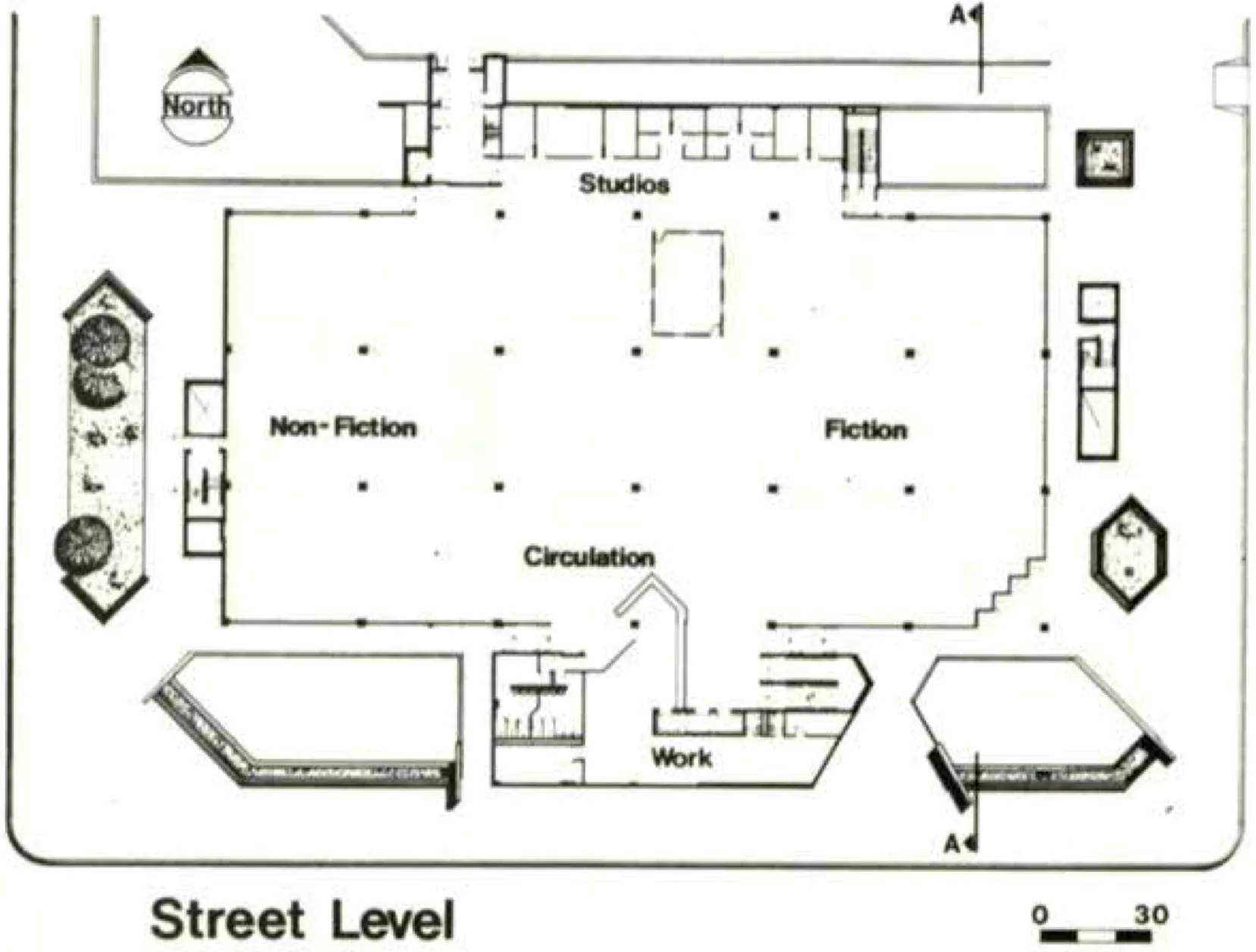
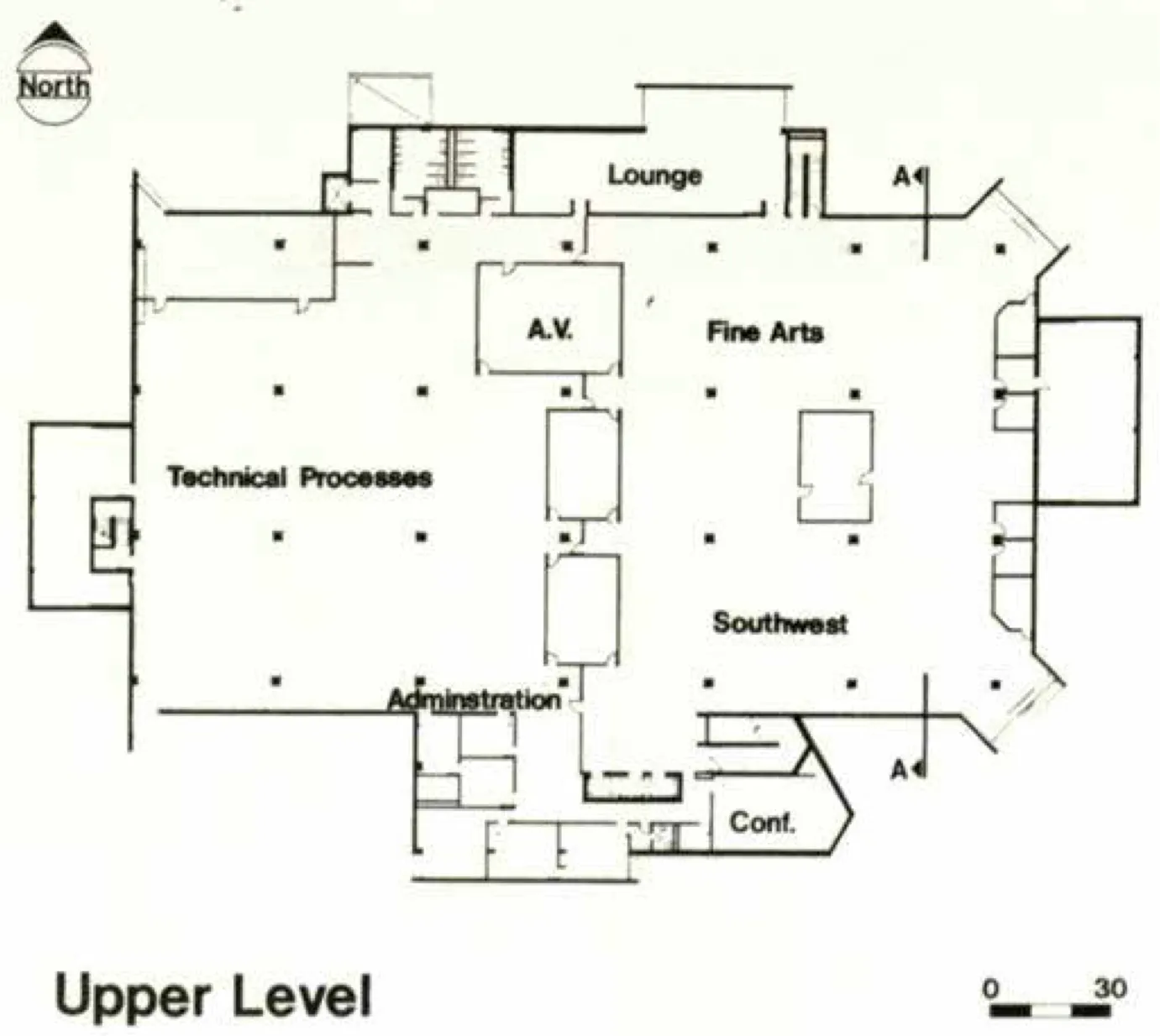
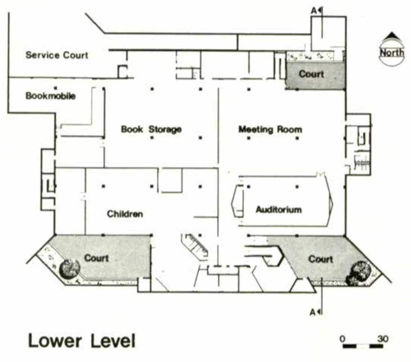
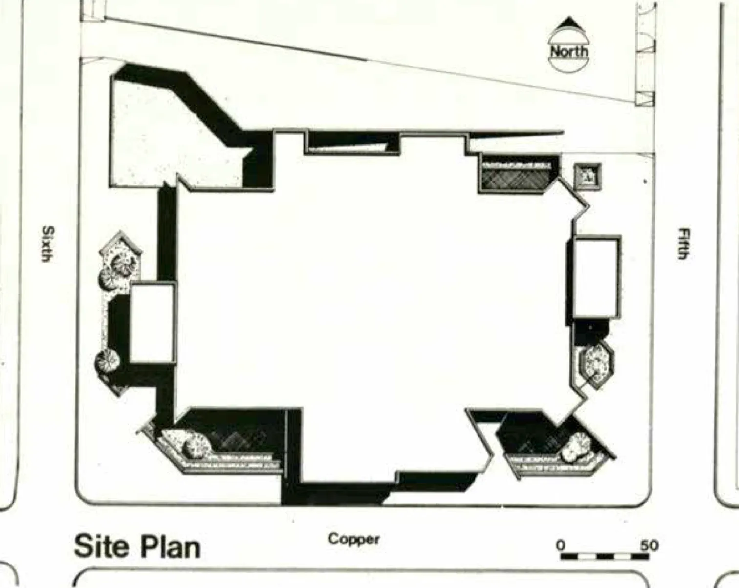
Pearl and his clients thus sought the most flexible public library in the country, a principle that is evident as a driving force in the structure that Pearl designed. The three levels of the building were dictated by program, site, and budget. On each, Pearl, Reichman, and Clark agreed to strive for a rectangular public space as large as the half-block site permitted, and interrupted by nothing permanent except the structural columns, 36 feet on center, to enable their goal of flexibility. All walls in these main spaces were built to be easily movable on nine-foot coffered ceiling modules, each with its own lighting, air supply and return, and connections to electrical, telephone, and video systems, making the structure truly reconfigurable. In order to keep these big spaces free, Pearl located heating and cooling equipment at the east and west ends of the central space and placed all other fixed elements in contiguous but “separate” buildings that made up the structure as a whole.
Pearl shaped these “separate” buildings based on the function each housed and by their relation to the site, maintaining the principle of open, flexible space both inside and out. For example, in order to preserve the openness of the main volume of public space, these masses project outside the central rectangle of the library. To also keep the street level as open as possible, Pearl designed these “separate” buildings to be carried by cantilevers. Elevators, stairways, restrooms, administrative offices, and conference rooms occupy the southern projection of the structure. With an angled form, this volume stands deliberately opposed to the otherwise rigid orthograph of the street pattern and the building’s primary structure in order to emphasize the main entrance. Fixed staff and service facilities occupy the northern building, where the staff lounge cantilevers over the ramp leading down to a service court at the northwest corner of the site.
Pearl forced the main volume of the library back from the property lines, thereby retaining more of the site for public space outside the building and creating visual interest in the building’s massing, which prominently displays separated projections. This configuration of large volumes set back from the adjacent streets by as much as thirty feet gave Pearl the opportunity to develop basement level courts around much of the building’s periphery. Three of these courts form public reading areas, sheltered from the noise and danger of the busy adjacent streets. A fourth basement court at the northwest corner of the building is devoted to all vehicular service including bookmobiles. The great advantage of these courts, aside from the interest and ambience that they provide the lower level, was that they precluded the need for a sprinkler system, more hazardous to books than fire, in the building.
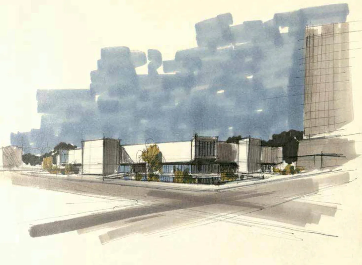
Another benefit of Pearl’s organizational scheme is that the main volume is set back so far from the street that large glass areas, well protected from the sun by the overhanging upper level, can reveal the most popular library elements to the passing public without the distractions of noise and heat. Pearl used glass sparingly on the upper level, where the main public collections are housed, and with maximum concern for providing architectural drama as well as clarification of orientation in the 30,000-square-foot space.4 On the rest of the library’s exterior, Pearl allowed the program to dictate the general appearance, with brick enclosing the majority of the building envelope. Many were dissatisfied that the final design was not a “traditional” New Mexico building like the “Old Main.” But as Pearl stated in 1971 in the Albuquerque Tribune, “There is a general feeling that regional-style architecture is no longer socially relevant. We feel that the building will have regional influences – but not archaeological ones. The Pueblo and Territorial style architectures, for instance, aren’t that important anymore.” Despite this statement, Pearl considered his library to fit into the New Mexico tradition of heavy massing with limited use of glass.5
The building takes a modern approach to the architecture of this region, yet does so in a language that was consistent with architecture culture more broadly at this time. Indeed, with its unapologetically muscular massing and monumentality, Pearl’s library tapped into the larger disciplinary trend of Brutalism that had especially became common in public buildings. Rugged and without concern for looking comfortable or easy, Brutalism could be understood as a reaction by a younger generation to the lightness and optimism of modernism well into the 1950s. As Reyner Banham stated in 1966, “Brutalism was posited not as a style but as the expression of an atmosphere among architects of moral seriousness.”6 Pearl’s building occupies its corner with gravity and heft, stating unambiguously that the library is, indeed, a serious institution. For his effort George Pearl gained recognition from the American Institute of Architects and until his death in 2003 considered it one of his best works.7
Despite such plaudits, by today’s standards many consider the main library’s design a failure, for its paucity of natural light and its lack of connection to the community that surrounds the building. Critics of the Brutalist style of modernism find buildings of this type unappealing due to their “cold” appearance, arguing that they project an atmosphere of totalitarianism. They also often associate them with urban decay, since typical materials like concrete tend to weather poorly in harsh climates and their vast surfaces are prone to vandalism by graffiti.8 But as late as 1984, ten years after the completion of the library, journalist V.B. Price offered a dramatically different view. “The library is above all a place to read, think and study,” he wrote. “Though it is protected from the noises and bustle of the city by setbacks from the sidewalk, it is not a fortress keeping people away. It welcomes individuals but does so with an entrance that is private in a personal, though accessible and public manner. It is a democratic building that opens itself to the well-to-do and the rest of us alike. Most important, I think, the public library, unlike many new buildings downtown, gives no signals that there are ‘undesirables’ about from which it and its occupants must be protected. It is at once a stately, friendly, and imaginative building with no pretentions or fears.”9 Public opinion has certainly changed, though time will tell how history ultimately regards Pearl’s innovative design.
Footnotes
-
David Steinberg, “Albuquerque/Bernalillo County Library System Celebrates Centennial with Novel Ideas,” Albuquerque Journal, 29 April 2001; David Steinberg, “Library Came at a Price,” Albuquerque Journal, 8 April 2006. ↩
-
City of Albuquerque Planning Department, “Old Main Library,” archived 27 May 2011, accessed 29 November 2015, http:http://www.cabq.gov/planning/lucc/omainlibrary.html. ↩
-
Cathy Robbins,_“_Albuquerque Public Library,” New Mexico Architecture, September-October 1975. ↩
-
Stevens, Mallory, Pearl and Campbell, Architectural Drawing Set, Albuquerque Public Library, 1971-1972, Stack 24, Drawer 15, SMPC Architects Drawings and Plans Collection (SWA SMPC), Center for Southwest Research and Special Collections, University of New Mexico, Albuquerque, NM. ↩
-
“The New Mexico Tradition and Our New Library,” Albuquerque Tribune, 22 July 1971. ↩
-
Reyner Banham, The New Brutalism: Ethic or Aesthetic? (London: Architectural Press, 1966), 12. ↩
-
David Steinberg, “Library Mural Plan Ridiculed,” Albuquerque Journal, 18 June 1999. ↩
-
“British Brutalism: A Closer Look,” Monumentum, Spring 2012. ↩
-
V.B. Price, “Public Library Haven of Trusting Hospitality,” Albuquerque Journal, 13 February 1984. ↩
