1938
William Burk, Jr.
Case study by:
Sharon Karpinski,Fri Oct 09 2015
Kelvinator House

Albuquerque’s “House of Tomorrow”
The 1933–34 Chicago World’s Fair buildings, at the time considered the height of American modernity, influenced United States architectural design for many years thereafter. The earlier 1893 Chicago fair, site of David Burnham’s Greco-Roman White City, had been criticized at the time as a retrograde design by Louis Sullivan and Frank Lloyd Wright. “The Columbian Exposition set back American architecture by fifty years,” Louis Sullivan declared. But forty years later, both of them commanded considerably more respect, and Chicago’s 1933 fair offered an architectural vision that was considerably more forward looking.1 That fair, called the “Century of Progress International Exposition,” which had been planned before the crash of 1929, opened in the middle of a worldwide economic crisis. Despite that fact, or perhaps because of it, the Century of Progress resolutely focused on an optimistic vision of the United States yet to come, a premise that proved wise: it attracted so many visitors that organizers kept the fair open for a second year.
One of the 1933 fair’s most popular exhibits featured thirteen futuristic houses clustered together on the shores of Lake Michigan.2 Those houses, built from innovative construction materials and with several examples clearly paying homage to the European “International Style” or the colloquial “Streamline Moderne,” turned out to be crowd pleasers. Few fairgoers actually contemplated living in homes like George Fred Keck’s Glass House, a three-story, glass-clad, polygonal tower suspended from a central pole that clearly owed a lot to Le Corbusier’s idea of the house as a “machine for living,” but most attendees marveled at the technology displayed within and without.3 Keck’s house controlled its own climate via central systems and sealed windows. It included not only a garage for the car but a hanger for the family plane. Keck’s design, which the fair billed as the “House of Tomorrow,” made the June 1933 cover of Popular Mechanics. The idea of an “automatic” house that heated and cooled itself, rotated to face the sun, and opened its own venetian blinds caught the fancy of fairgoers. It likewise influenced architects throughout the United States in the subsequent years before World War II. Bits and pieces of the fair’s dramatic architecture showed up on the cultural periphery, even in places like New Mexico, a location that many Americans thought was not even part of the United States, and even in Albuquerque, its largest city but one that contained only about 30,000 inhabitants in the mid-1930s. One of those architects, William Burk, Jr., a local practitioner in Albuquerque, demonstrated this far-flung influence and the way it transformed residential architecture in the United States. He brought the design elements of both the International Style and the more mass-market-oriented Streamline Moderne style together in the house he built on Hermosa Drive SE in the late 1930s, in the city’s Granada Hills district, the subject of this case study.
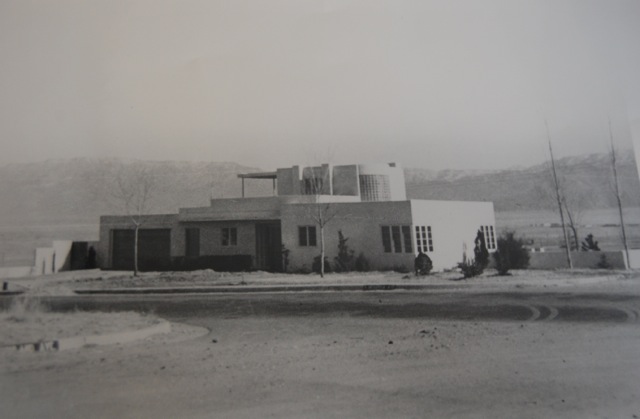
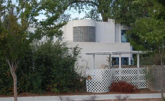
In a town full of faux-adobe casitas, Burk’s white stucco construct, featuring a wall of windows on its downslope side behind a glass brick prow aimed toward Highland Avenue (now Coal Avenue), was like no other dwelling in the city. Burk’s second floor, flanked on both sides by the railings of the roof decks, looked more like the bow of the Ile de France than it did a dwelling, at least from the south side. Since it stood on a treeless hill with almost no other houses around it, the house attracted a lot of attention even before completion. The only structure it resembled for most observers was the Phillips 66 service station on nearby Central Avenue that, not so coincidentally, Burk had also designed.
Actually, although Burk’s house reflected both stylistic and integral features of the International Style, as set forth particularly by Le Corbusier – especially a non-axial floor plan concerned with volume rather than mass and rooftop terraces connected to an indoor/outdoor recreation room, all lit by those floor to ceiling window walls – the Albuquerque house also owed a lot to another property that had appeared at the Chicago Fair. The appliance manufacturer Frigidaire had sponsored the “Frigidaire Air-Conditioned House” to showcase that people could live comfortably year-round in even the hot and humid summer and icy winter of the Midwest by using their air-conditioning and heating equipment.4 The Frigidaire house, like the property Burk subsequently built, had an attached garage directly accessing the house to emphasize the owner’s control over the environment (there would be no wet feet in inclement weather) and an elaborate heating and cooling system operated from a central control panel on the main floor. Its “leisure lounge” was a highlight of the home. The sponsor described it as a space where the wife could “thoroughly enjoy her afternoon siesta” or her husband could “completely relax after a hard day’s work.” The house, in other words, was modern, urban, laborsaving, and reflective of how the contemporary city dweller or suburbanite aspired to live, in part with the aid of new technology. Over the next few years, a score of buildings that likewise characterized the home as a machine sprang up across the United States. Burk’s design at 324 Hermosa Drive SE was one of them, a fact suggested even in the house’s nickname, the “Kelvinator House.”
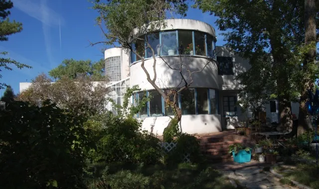
Indeed, Walter Raabe, a local hardware store owner, had commissioned Burk to put up his own version of a “demonstration house” that would illustrate how Kelvin Appliances, which Raabe sold, could make Burk’s house a design of the future. Although not large (it started life with only two bedrooms and one bath) the demo house included a partial second floor devoted entirely to indoor/outdoor leisure and entertaining. Circular stairs lit by that glass block wall led to this purely recreational space. Burk’s second floor was and still is an improvement on the basement rec room that would follow as a staple of postwar suburbia. A large rooftop terrace created additional living space in dry weather, an idea well suited to New Mexico. The entire plan pivoted around the core of the house. The front door opened into a vestibule at the center of the core, a space holding the closets, fireplace and stairs to the second floor. Off the vestibule to the right was the bedroom and bath wing. To the left was the kitchen with its door to the garage. Straight ahead, the vestibule opened directly to the living room’s curved wall of windows, the house’s most theatrical gesture, with outdoor decks beyond, leading to a large, terraced yard.5 The house’s central core grounded the spacious, dramatic first floor. For such a small house, the design delivered generous, pleasing public spaces well separated from the bedrooms. After the country’s brief romance with bungalows in the early part of the twentieth century, a clear separation between private and public space again had become the standard for American homes. Even today, the Kelvinator House notably emphasizes this compartmentalization, cloaked in the era’s newest design language.
Likewise, the kitchen of the Kelvinator House still accurately reflects the era’s preoccupation with the “machine ideal” of efficiency. The kitchen had become industrial space, at least philosophically, rather than a family setting. The housewife, its operator, personified the domestic scientist. In upscale neighborhoods like Granada Hills, the automobile itself became part of the house-as-machine, so the Kelvinator housewife walked directly from her attached garage into the kitchen to put down the groceries or unload the kids. She could also easily reach the basement from the kitchen, for quick access to the laundry room and the house’s mechanical systems. The house’s front entryway, although adjacent to the driveway and garage, was clearly intended more for visitors than for the family. It presents a curvaceous Moderne facade that replicates the glass curve of the recreation area above it, a stark contrast with the utilitarian entry directly into the kitchen.
Inside the kitchen, the housewife found a space that presumed a modern, servantless household, as did the Frigidaire prototype at the World’s Fair. Both kitchens illustrated the time and motion study principles for domestic efficiency as promulgated by Christine Frederick and Lillian Gilbreth in the 1920s.6 Gilbreth even filmed the kitchen worker attached to a flashlight in a darkened room to trace her pathways as she cooked and cleaned. These women, both engineers, shrank the spacious Victorian kitchen to save the housewife steps and logically organized the remaining space to save time and effort.7 Burk’s design for the kitchen on Hermosa Drive included fitted metal cabinets to store food and utensils near the work area, a startling departure from the sink pantry of the Victorian era—that completely separate room far from the kitchen stove and the only place in most houses with storage cabinets. The sink itself, along with fitted counters on both sides for food preparation, became an integral part of the kitchen, located only steps from the electric stove which was, in turn, located only steps from the dining area tucked into an alcove off the living room. The formal dining room had gone the way of the maid that the modern housewife no longer needed. Over the sink a bank of casement windows illuminated the space. Their industrial steel window frames further emphasized the idea of the kitchen as a production space. So did the heating and air-conditioning controls for the entire house, which were located on the wall above the stove. A folding ironing board, which disappeared into the wall when not in use, completed this picture of modern housewifery. Naturally, the latest Kelvinator appliances furnished the kitchen and laundry rooms. This was no surprise, since the Raabe and Mauger Hardware Company publicly stated that they had built the house to “prove that a family of moderate income can enjoy the fruits of modern housing research.” They continued, “the Kelvin-Home will feature many advanced improvements not embodied in residences costing several times its price_…_[including] a scientifically planned and equipped kitchen.”8
What was not in the Kelvin-Home was any wasted space in the food prep area. One cook fit. Two cooks didn’t. The era’s kitchens banished fripperies like a place to sit with that second cup of coffee or a perch for the family cat. This 1930s ideal (houses far less futuristic than the Kelvinator House had small, tightly efficient kitchens with no eat-in capacity) fell from favor within twenty years. Few 1930s kitchens survive intact. They fell victim to the trends of husbands who cook, children who need questions answered and access to afternoon snacks, and mothers who wish to talk to the rest of the family while they stir the soup. In fact, the tiny kitchen betrays one of the conundrums of these supposedly modern Houses of Tomorrow. Although they were built for modest families, they don’t suit the needs of a household without servants well at all.
That was particularly true of Burk’s design for this house and the site outside its walls. The Kelvinator House stands on a large terraced lot which cannot easily be observed from the “working” areas of the house. The kitchen windows look out to the streetscape in front of the house. The domestic scientist whipping up a soufflé in the kitchen could not see what her children were up to in the commodious back garden. The house didn’t accommodate a nursemaid or, in her stead, a cook so that the mother could spend time on those expansive, outdoor spaces with her children. The patios and terraces surrounding the living room’s semicircular windows were clearly designed for outdoor living. Mrs. Raabe, an avid horticulturist, insisted on a permanent greenhouse connected to the master bedroom and the east frontage terrace that she filled with ornamentals. But the rear yard is a big, complex space that demands a lot more effort than just cutting the grass.9 A gardener seems necessary, as well as an at-least-part-time child minder, but the Kelvinator House can comfortably accommodate neither. The 1930s “Houses of Tomorrow” still observed formal separations like the closed kitchen or the dedicated dining area. Family areas or playrooms adjacent to kitchens don’t appear in their plans. Although architects stressed efficiency so that one lone homemaker could make that home, their actual designs seem sometimes to undermine the whole concept. Basement laundries were common, for example. How was a housewife from the modest family that the Kelvinator House and its contemporary prototypes hypothesized supposed to cook, clean, do the laundry, and iron while keeping an eye on the kids?
As the house’s current resident explains, “The servant’s quarters in Downton Abbey were a palace compared to what the Raabes’ domestic workers got.”10 The Raabes did, indeed, employ a maid and a gardener, suggesting their own realization of the limitations of their home. The realities of the site precluded the efficiency of the design for a house without “help.” The Raabe servants lived in the basement, which has no on-grade windows, only window wells, and no real room divisions. Since the plumbing extended to the basement level for the laundry, a rudimentary restroom and a shower were rigged. But that was about it for amenities. The Century of Progress collided with Depression-era Albuquerque. Help was cheap.
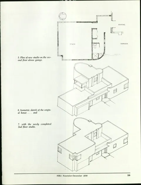
Edna Heatherington, then a master’s degree candidate in architecture at the University of New Mexico, bought the Kelvinator House in the 1970s. She subsequently designed and built an addition that provided private spaces commensurate with the large, gracious public spaces the house had always had. Heatherington and her husband added a second-story studio for her, and created an expansive master bedroom and bath from part of the original rooftop recreation space. The addition, which Heatherington described for New Mexico Architecture in 1976, was a “Theoretical Revival of an International Style House.” As she explained of her design, “the volume of the garage is expanded upward: the original horizontality is changed to a balance of larger volumes on each side of the entrance, toward which both sides curve. The curve of the new wall above matches the curve of the old wall below, and both move in toward the center where the terrace steps back above the front door. Sharp edges and smooth surfaces, especially the unbroken curve and flatness of the front (west) wall, appear cloudlike and weightless.”11
The house today looks like it always had a nearly full second story. The addition blends seamlessly. It also solves most of the problems inherent in Burk’s original “modest” home, which lacked substantial private spaces. Heatherington’s studio, currently used as a his-and-hers office by the present owner, could also serve as a large indoor family space, private but with views of the Manzanos. For a family with older children, the downstairs bedrooms provide excellent teen space separate from the parents’ sanctum on the second floor. The kitchen remains too small, a problem even recent renovations cannot overcome, but the rest of the house works so well that it is easy to overlook that one problem. At nearly eighty, the Kelvinator House is a house for today.
Footnotes
-
“Chicago: City of the Century,” American Experience, accessed 4 October 2015, http://pbs.org/wgbh/amex/chicago/peopleevents/p_sullivan.html. ↩
-
H. Ward Jandl, John A. Burns, and Michael J. Auer, Yesterday’s Houses of Tomorrow: Innovative American Homes, 1850–1950 (Washington, DC: Preservation Press, 1991, 130. ↩
-
Ibid., 132-139. ↩
-
Lisa D. Schrenk, Building a Century of Progress; The Architecture of Chicago’s 1933-34 World’s Fair (Minneapolis: University of Minnesota Press, 2007), 179-180. ↩
-
“National Register Nomination Form for Kelvinator House,” 7 September 1978, Box 1, Folder 9, Bainbridge Bunting Papers (MSS 385 BC), Center for Southwest Research and Special Collections, University of New Mexico, Albuquerque, NM. ↩
-
Alexandra Lange, “The Woman Who Invented the Kitchen: She Couldn’t Cook,” Slate, 25 October 2012, accessed 1 October 2015, http://www.slate.com/articles/life/design/2012/10/lillian_gilbreth_s_kitchen_practical_how_it_reinvented_the_modern_kitchen.html. ↩
-
Rain Noe, “A Brief History of Kitchen Design, Part 4: Christine Frederick’s ‘New Housekeeping’ and Margarete Schütte-Lihotzky’s Frankfurt Kitchen,” Core 77, 1 July 2011, accessed 1 October 2015, http://www.core77.com/posts/19779/a-brief-history-of-kitchen-design-part-4-christine-fredericks-new-housekeeping-and-margarete-schtte-lihotzkys-frankfurt-kitchen-19779. ↩
-
“Kelvin Home for W.C. Raabe,” Albuquerque Progress, February 1938. ↩
-
Nance Crow, interview by author, Albuquerque, NM, 1 October 2015. ↩
-
Ibid. ↩
-
Edna Heatherington Bergman, “Theoretical Revival of an International Style House,” New Mexico Architecture, November-December 1976, 15-20. ↩


