1974
W.C. Kruger and Associates
Case study by:
Samuel Strasser,Fri Oct 09 2015
Humanities Building, University of New Mexico

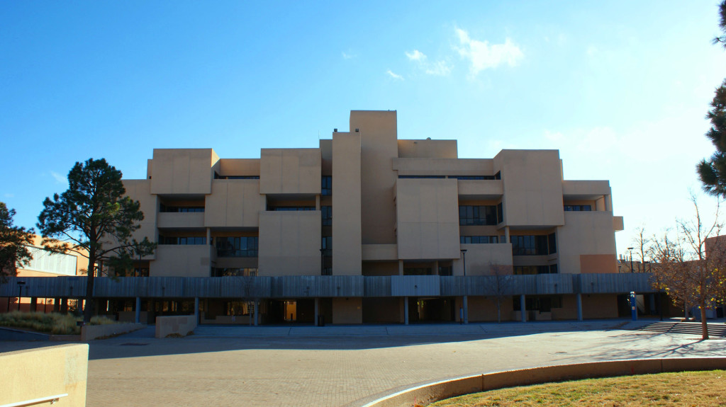
The University of New Mexico’s Humanities Building is located on the school’s main campus, directly across Smith Plaza from Zimmerman Library. Designed by W.C Kruger and Associates, whose firm most notably designed the laboratory where the first atomic bomb was developed in Los Alamos, New Mexico, the Humanities Building opened in 1974 as part of a broader campus expansion project that also saw the addition of the new UNM Bookstore, Ortega Hall and Woodward Hall.1 Constructed of beige plastered concrete and composed of abstracted cubic forms, the building embodies the turmoil of the seventies in its Cold War-era, Brutalist architecture.
Cold War Architecture
Indeed, the early 1970s were tumultuous for the city of Albuquerque as well as the United States as a whole. Following the May 1970 Kent State shootings, where National Guard troops shot 13 students – wounding nine and killing four – at the Ohio university during protests of President Nixon’s troop allocation to Cambodia during the Vietnam War, Albuquerque suffered a similar incident. In the same month, National Guard troops here bayoneted students likewise protesting against the Vietnam War at UNM’s Student Union Building.2
Needless to say, tensions across the nation were high. The Cold War, nuclear testing, the Soviet Union, Communism, and the threat of total annihilation created an atmosphere of fear, paranoia, and xenophobia in the United States, phenomena that showed up in the built environment too. Tom Vanderbilt, in his book Survival City, explains, “In the Cold War, all architecture was military architecture.”3 Cold War architecture was about survival. With the very real possibility of nuclear destruction, the goal of the United States was to outlast the Soviet Union in the event of total war. As Leo Hoegh, director of the U.S. Office of Civil and Defense Mobilization, said in the late 1950s, “The country which survives the best will win.”4
While the nation may have lived in constant fear and uncertainty, not all was bad. The University of New Mexico saw relative success in these years. As William A. Dodge writes in his history of UNM, “The Popejoy era [1948-68] saw a tremendous growth in the university’s enrollment and significant changes to the physical layout of the campus.”5 He goes on to say that the transition the university saw from a state-centered campus to a regionally, if not nationally, recognized institution was evident from the increasing numbers of enrolled students as well as the number of new buildings that took form.6 This surge in university enrollment can be linked to the returning World War II veterans who attended college on the GI Bill, but also to the escalation of the Vietnam War. Students who attended a university at the time of the draft could qualify for a deferment program that exempted them from military duty until the end of their college enrollment.
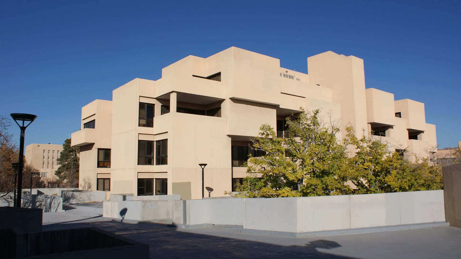
To sum things up more bluntly, the Cold War and associated Vietnam War fueled UNM’s growth and prosperity in this era, allowing the continued expansion of the campus and the subsequent construction of the Humanities Building, while the tension and fear of the Cold War likewise influenced the bunker-like form in which Kruger’s firm designed the project. This defensive-seeming form related to broader architectural trends of the era, but has some local roots as well. Looking at the Humanities Building, one may not immediately guess the architect’s subtle attempt to imitate the Ancestral Puebloan architecture of the Southwest; however, according to Dodge, this was Kruger’s intent when designing the building.7 In an era when fear and paranoia pervaded daily life, safety and a controlled environment were remedies for constant worry. This was true for the Ancestral Puebloans, whose homes took a form based on their own safety concerns. Their large housing complexes, like Pueblo Bonito in northwestern New Mexico, were an amalgamation of several homes stacked one on top of another in a fortified complex meant to slow down or repel invaders. These Pueblo complexes had small openings and massive walls that represented the Puebloan strategy for creating defensive dwellings. Kruger drew from this precedent in designing in a different era of fear. Similar to the Pueblos, the Humanities Building conveys safety with minimal glazing and massive concrete walls fronting each protrusion of the building. The stacked nature of the cubic masses here also justifies the Pueblo analogy. In addition, Kruger covered the building’s concrete forms with stucco to imitate the “Southwestern” style that the rest of UNM’s campus embodies. In these ways, the Humanities Building relates to its local and regional contexts, as well as the international context in which it arose.
Brutalist Influence
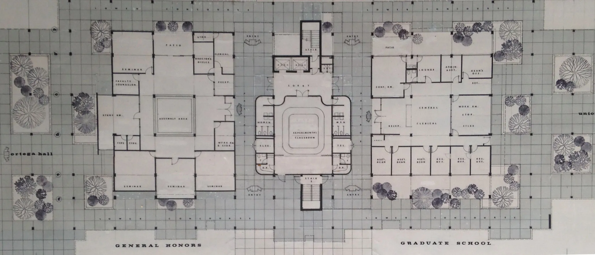
Indeed, massive walls and minimal setback glazing all channeled the formal experiments common to modern architecture more broadly in the era of the Cold War. Nuclear blasts and fallout were the two main safety concerns in Cold War-era architecture. Glass posed the greatest threat to inhabitants when a nuclear blast went off, since the ensuing blast wave could shatter windows and send shrapnel flying at high velocity toward any civilian within. This suggests one reason – symbolic as well as literal – for the articulation of glass seen on the Humanities Building. Setting the glazing back with half walls surrounding decks would minimize the effects of any pressure wave. A civil defense manual of the era also notes the potential defensive aspect of landscaping in the event of nuclear attacks. The manual states, “Use planters for barriers… trees provide thermal shield but are subject to burning.”8 Indeed, Kruger did plan ample space here for tree planters to surround the building, as is evident from the floor plans.
Similarly, architectural manuals and guidelines related to civil defense in this era also praised spaces for “flexibility, cost effectiveness, and inconspicuousness.”9 Notably, the landscape and the markedly experimental classroom space of the Humanities Building are good examples of this approach toward Cold War-era architecture. In this era UNM sought to make its campus more pedestrian friendly, an intention that formed part of the motivation for the General Development Plan that John Carl Warnecke and Associates completed for the university in early 1960.10 With this goal in mind, the trees mentioned above can be seen as playing a dual role in the Humanities Building’s site design. They not only followed Warnecke’s plan for campus beautification, but were also a cost effective way to add heat shielding to surrounding buildings, thus following the era’s guidance to keep defensive design decisions inconspicuous to the public. The general public would not have questioned the decision to add trees around a public building. Likewise, spaces marked as an “experimental classroom” and a designated “assembly space” on the ground floor also provided inconspicuous, flexible, and cost-effective means of shelter for students and faculty without being completely forthright about the intentions of the design. Regardless of whether these decisions were explicitly intended as protective measures in an era of anxiety or implicitly channeling the new concerns of the age, they programmatically and formally reflected larger architectural responses to the Cold War seen in bunkers, defense installations, and everyday buildings, especially public structures like this one.
Kruger likewise drew from the approach to architectural modernism known as Brutalism, a stylistic trend in this era that designers especially employed in the context of public buildings. Seen across the globe in the major cities of Europe and the United States alike, this approach, characterized by massiveness, muscularity, and extensive use of concrete, was often used in government structures to convey strength, steadfastness, and purpose. Universities in the United States during the late 1960s also became key sites for the rise of Brutalism, as they experienced rapid expansion and embarked on extensive new construction, a development that UNM likewise experienced at this time. The University of Massachusetts Dartmouth, then known as the Southeastern Massachusetts Technological Institute, provided one notable example of the use of Brutalism in an academic context. Designed entirely by architect Paul Rudolph, the campus’s concrete buildings achieved a monumental scale that suggested the growing student bodies and multiple purposes that universities came to serve in the postwar period. While Rudolph was one of the most noteworthy architects of Brutalism, Reyner Banham was the most noteworthy theorist. Banham wrote about large buildings that did not merely serve a single purpose but took on a complex form housing a variety of purposes; he called these “megastructures.”11 In both form and function, the Humanities Building follows these strategies, with its hulking mass supporting its multi-purpose nature—a fact suggested even in its generic name. Multiple programs are housed within the building, including a library, seminar classrooms, a lounge, assembly space, and the offices of several different departments, achieving a megastructural complex at the center of campus.
Circulation and Usage
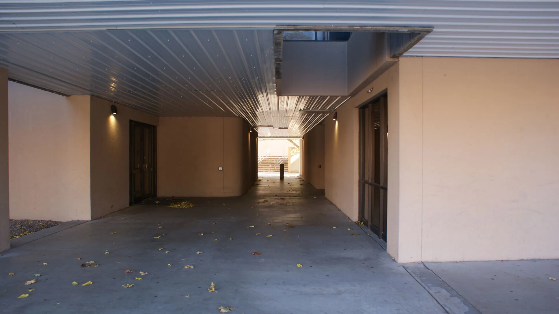
When one walks around the Humanities Building one instantly notices the peculiar treatment of hallway and passage space from one area to another. That is to say that there is no internal circulation on the ground floor of the building. Exterior spaces lead directly to main offices with reception desks or waiting areas that greet any incoming pedestrian. One gets a sense that someone without a purpose for being in the building would instantly feel pressured to find his or her purpose lest they are asked to leave. This is an odd approach to public and private space in an era when other modernist building types were pursuing the opposite strategy. In a shopping mall like Victor Gruen’s Southdale Center, for example, the exterior circulation space of the typical main street became internalized as an air-conditioned interior corridor, and the large open plazas once common in commercial centers became food courts and large indoor thoroughfares.12 However, when one considers the sometimes violent nature of college campuses at this time and the fears of this era, it could be argued that pushing all circulation to the exterior could prevent any bottlenecking in times of crisis for students and law enforcement alike. Another peculiar treatment of exterior circulation here can be witnessed in the elevated walkways that surround the Humanities Building, the Art Building, and Ortega Hall. A network of stairways and walkways allows for unimpeded traffic flow between these three buildings. This may perhaps be another attempt to mitigate harm in times of crisis, but the motivation for this gesture is less evident. At the very least, it certainly contributes to the sense of this as a megastructure and even as part of a larger, multi-building complex.
Interior Atmosphere
Inside, the Humanities Building feels sterile and oppressive. Most of the light in the interior space comes from fluorescent lighting rather than natural light, suggesting that this is a building about purpose. It stands to serve its function with little fanfare or adornment. This interior in many ways matches the oppressive nature of the exterior facade. Narrow, straight hallways, dimly lit vertical circulation shafts, and unceremonious entries offer little excitement for those who frequent the building. The building offers as much warmth and embrace as a military bunker, save for some carpet and ceiling tiles here and there. In other words, it maintains its formal themes inside and out, making for a utilitarian structure but not necessarily a welcoming one.
In summary, the Humanities Building at the University of New Mexico took shape at a time when fear and paranoia pervaded the nation’s psyche. In an era of great turmoil for the nation and the campus, safety was a primary concern for new buildings. The bunker-like design of this structure can be connected to the architectural trends of the Brutalist strain of modernism, then, but also to the Cold War and Cold War-era architecture. Today it stands as a relic of a time when the threat of total annihilation and all-out nuclear war were real possibilities, a reminder of an era not too long gone.
Footnotes
-
“W.C. Kruger Architectural Drawings, circa 1930-1989,” Center for Southwest Research, University of New Mexico, accessed December 12, 2015, http://rmoa.unm.edu/docviewer.php?docId=nmuswakrugerdrawings.xml. ↩
-
Strail Keyohara, “Use of Guard Questioned,” Albuquerque Journal, 20 May 1970. ↩
-
Tom Vanderbilt, Survival City: Adventures Among the Ruins of Atomic America (New York: Princeton Architectural Press, 2002), 100. ↩
-
Ibid., 101. ↩
-
William A. Dodge, “The University of New Mexico: A Historical Narrative,” in Campus Heritage Preservation Survey: University of New Mexico (Albuquerque: University of New Mexico, December 2006), sec. A, 23, accessed 13 December 2015, http://iss.unm.edu/PCD/docs/Getty_Report/GettyProject_Vol1_All.pdf. ↩
-
Ibid., 23. ↩
-
Ibid., 24. ↩
-
Vanderbilt, 103. ↩
-
Ibid., 106. ↩
-
Dodge, sec. A, 17. ↩
-
Reyner Banham, Megastructure: Urban Futures of the Recent Past (New York: Harper and Row, 1976). ↩
-
Marni Epstein-Mervis, “How the Cold War Shaped the Design of American Malls,” Curbed, 11 June 2014, accessed 12 December 2015, http://curbed.com/archives/2014/06/11/how-the-cold-war-shaped-the-design-of-american-malls.php. ↩


